Whether you’re a seasoned Agile practitioner or new to the methodology, a Burndown Chart can be a valuable tool to steer your teams toward success. So, how do you interpret a burndown chart?
At its core, a Burndown Chart is a visual representation of work left to do versus time. This simple yet powerful tool offers a snapshot of work progress at a glance, making it an indispensable asset for Scrum Masters and team members alike. In Agile environments, where adaptability and responsiveness are key, a Burndown Chart serves as a navigational aid, helping teams stay on course and adjust their strategies throughout the Sprint.
A Burndown Chart doesn’t just track progress; it provides insights into the health of a Sprint. It helps teams identify when they are on track, falling behind, or ahead of schedule, and most importantly, it guides them in making informed decisions to keep work moving forward efficiently.
Understanding the Basics of a Burndown Chart
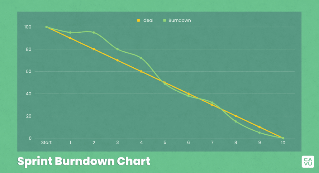
A Burndown Chart is fundamentally a graphical representation that displays the amount of work left to do versus the time available to do it. Let’s break down these components for a clearer understanding:
1. The Axes: Time and Work
- X-axis (Time): This axis typically represents the timeline of a particular initiative. It could be measured in various units. A Sprint Burndown typically uses days while larger initiatives, like a release, will often use Sprints. The timeline starts from the beginning of the initiative or Sprint and ends at its anticipated completion.
- Y-axis (Work Remaining): The vertical axis shows the amount of work that needs to be completed. In Scrum, this work is typically quantified in story points but could also be measured in other ways, such as the number of tasks or even hours. The scale is set based on the total amount of work identified at the start of the tracking period.
2. The Burndown Line
- This is the heart of the chart. As work progresses and tasks are completed, the line descends from the top left (high amount of pending work) to the bottom right (work completion). The slope of this line indicates the rate at which work is being completed.
3. Ideal Progress Line
- Often, Burndown Charts include a reference line showing the ideal rate of work completion. This straight line cuts diagonally across the chart from the starting point (total work) to the endpoint (zero work). It acts as a guideline for what the work progress should ideally be at a given time.
Example:
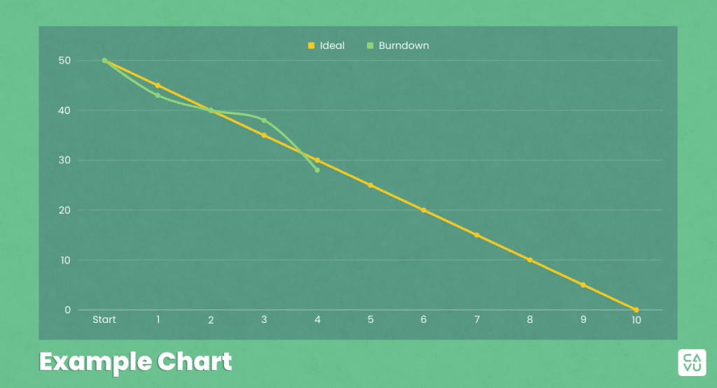
Let’s use the example above, imagine a two-week Sprint with 50 story points worth of work. The X-axis would represent the 10 working days of the Sprint, and the Y-axis would start at 50 story points. As the team completes work each day, the Burndown Line would descend accordingly, showing the remaining story points.
The beauty of this chart lies in its simplicity and the immediate visual feedback it provides on the health and pace of our work. In the next sections, we will explore how to interpret different patterns in the Burndown Line and what they signify about your team’s progress.
Interpreting the Chart
The chart’s visual nature allows for quick assessment of work progress, but understanding what different patterns indicate is key to effective time management.
Reading the Slope of the Chart
The slope of the Burndown Line is a direct indicator of the team’s progress. A steep decline suggests rapid progress, whereas a more gradual slope indicates slower progress.
An optimal Burndown Chart will closely follow the Ideal Progress Line, indicating that the team is on track to complete the work within the allocated timeframe. Neither behind schedule, nor ahead.
Ideal vs. Actual Progress
A Burndown Chart typically contrasts the actual progress with the ideal. If the Burndown Line is above the Ideal Progress Line, it indicates that the team is behind schedule. Conversely, if it’s below, the team is ahead of schedule.
The gap between these lines can help you estimate how far off track the Sprint (or release) might be and the effort required to realign with the planned schedule.
Common Variations Illustrated
By examining common scenarios represented in these charts, teams can better understand their implications and plan accordingly. Here are three typical scenarios you might encounter:
Common Variations in Burndown Charts
- Steep Decline: This suggests that the team is completing tasks faster than planned. It could be due to underestimation of tasks or a highly efficient team.
- Gradual Decline: Indicates a more balanced pace of work. It means that work is being completed in small increments. This is what teams should strive for.
- Plateaus: A horizontal line suggests no progress. This could happen due to blockers or dependencies halting the work, too many large backlog items in the Sprint, or team members focusing on many separate pieces of work, and not driving it to done together.
- Increases: An upward trend in the line indicates increasing work – a sign of scope creep or additional work being added to the Sprint or Release plan.
Analyzing Sprint Progress
For a Sprint Burndown, daily changes in the chart can provide insights into the team’s day-to-day operation. For instance, no change for consecutive days may signal a problem that needs investigation. Ideally, a Burndown Chart should reach the bottom right corner (zero tasks remaining) by the end of the time allotted. If it doesn’t, it could indicate unfinished tasks or scope changes.
Common Work Scenarios Using a Burndown Chart
Interpreting a Burndown Chart is not just about tracking if tasks are being completed. It’s about understanding the dynamics of your workflow, identifying potential issues early, and taking timely action to ensure success. In the next section, we’ll delve into different scenarios illustrated with Burndown Charts to further refine our interpretation skills.
On Track
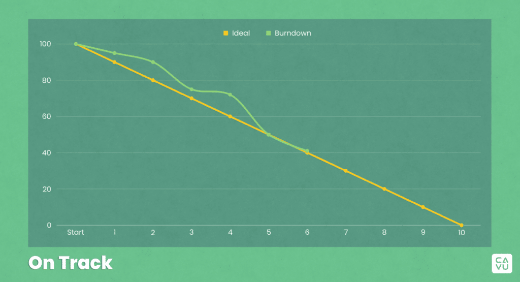
- Chart Characteristics: The Burndown Line closely follows or slightly fluctuates around the Ideal Progress Line.
- Interpretation: This pattern indicates that the work is on track. The work is being completed at the expected rate, or the initiative is likely to meet its deadline.
- Action: Continue with the current strategy, but remain vigilant for any changes that could affect progress.
Behind Schedule
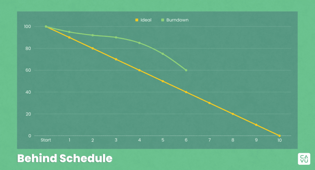
- Chart Characteristics: The Burndown Line is consistently above the Ideal Progress Line, possibly flattening out or showing less of a downward trajectory.
- Interpretation: The team is lagging behind the planned schedule. This could be due to various factors like underestimated tasks or unforeseen obstacles.
- Action: Investigate the causes for delays. Consider reprioritizing work, or adjusting timelines to get back on track.
Ahead of Schedule
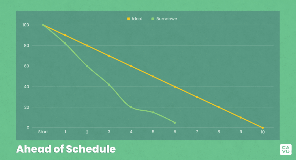
- Chart Characteristics: The Burndown Line falls below the Ideal Progress Line, indicating faster progress than planned.
- Interpretation: The work is ahead of schedule, which might be due to increased efficiency, but could also be due to overestimation of Backlog Items.
- Action: Assess whether this pace is sustainable without compromising quality. It indicates there may be an opportunity to pull in additional Backlog Items.
Stalled Progress

- Chart Characteristics: The Burndown Line shows a horizontal trend or plateaus for a significant duration.
- Interpretation: A plateau in the Burndown Chart suggests that the team’s progress has stalled. This could be due to various reasons such as encountering blockers, unresolved dependencies, team members being unavailable, or other external factors halting progress.
- Action: Immediate action is required to investigate and address the cause of the stall. Identify and remove blockers, resolve dependencies, or request additional help as necessary. It may also involve revisiting the project plan to make adjustments.
It’s important to note that the chart is a tool for guidance and not an absolute indicator of success or failure. The real value lies in its ability to provide insights into project trends and facilitate proactive team coaching.
Analyzing Deviations and Taking Action
When a Burndown Chart deviates from the expected trajectory, it’s a signal for the team to analyze the situation and take appropriate action. Understanding these deviations and responding effectively is key to maintaining the health and success of your initiative.
Identifying Issues
- Scope Creep: If the chart shows an upward trend or sudden spikes in work, it could indicate additional tasks being added, known as scope creep. This requires reassessment of priorities and scope boundaries. This issue is especially common in large initiatives at the organization level.
- Extra value: On the positive side of an increase trend, the team could be finishing early and taking in additional work. This is the exact behavior we want to see on a Scrum Team and indicates team acceleration.
- Bottlenecks: Plateaus or slower descents might signify bottlenecks. Identifying these early and addressing the root causes (like dependencies or resource constraints) is crucial.
Taking Corrective Actions
- For Scope Creep: Engage with stakeholders to clarify and re-prioritize the backlog. Ensure that any addition of work aligns with current goals and available resources. Ask your stakeholders if they are willing to delay the completion of the initiative to incorporate this new work.
- For Bottlenecks: Implement strategies like task-swapping among team members, getting help from other teams, or breaking down complex tasks into smaller, more manageable ones.
Proactive Steps
- Retrospectives: Use Sprint Retrospectives to discuss what went well and what didn’t, and to devise experiments for improvement.
- Transparent Communication: Maintain open channels of regular communication across the team(s) and with stakeholders to ensure everyone is aligned and aware of current status and challenges.
Learning and Adapting
Use deviations not just as a cue for corrective actions, but also as learning opportunities to improve future Sprints and initiatives.
Use your chart to document lessons learned and apply these insights in future planning and execution phases. You can do this by reviewing the Burndown Chart with your team in your Daily Scrum or your Sprint Retrospective. If your chart is for a longer time window, such as a Release, then consider performing a Retrospective on that longer time window.
Deviations in a Burndown Chart are not merely setbacks but opportunities to fine-tune processes and strategies. By understanding their Burndown Chart, teams can identify challenges earlier and take decisive action to steer work back on course toward successful completion.
Advanced Considerations
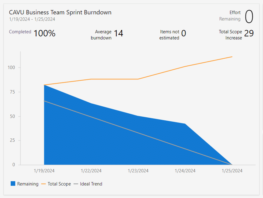
When teams become more adept at using Burndown Charts, they can start to explore advanced considerations that delve deeper into the dynamics of Agile process management. These advanced considerations can help in fine-tuning the use of Burndown Charts for more complex situations.
Handling Scope Changes
- Adjusting the Chart: When the scope of the work changes significantly, it may necessitate adjusting the Burndown Chart. This could mean resetting the Y-axis to reflect the new amount of work or creating a new chart altogether. Additionally, many tools will simply increase the Burndown Line to reflect the addition of new work to the timebox. Some tools will even render an additional like that shows increasing scope over the span of the time-box.
- Tracking Scope Changes: Document any scope changes and their reasons. This helps in understanding their impact on the expected end-date and aids in future planning and estimation.
Dealing with Unplanned Work
- Reflecting Unplanned Work: Incorporate unplanned tasks into the Burndown Chart as soon as they are identified. This gives a more accurate picture of work status. Learn more about the Interrupt Buffer Pattern for how to best handle this scenario.
- Analyzing the Impact: Regularly review the impact of unplanned work on the Burndown Chart and adjust course as necessary.
Removing Tasks from the Chart
- Task De-scoping: Sometimes tasks are removed from the scope of work. Reflect these changes in the chart to maintain accuracy.
- Impact on Team Morale: Be aware that removing tasks can affect team morale and expectations. Clear communication about why tasks are being removed or de-prioritized is essential.
Predictive Analysis
- Trend Analysis: Use the data from current and past Burndown Charts to predict future trends and potential risks in upcoming Sprints or initiatives.
- Continual Refinement: Use these predictive insights to continually refine the team’s working methods, estimation accuracy, and response strategies.
Integrating with Other Agile Metrics
- Complementary Tools: Combine insights from the Burndown Chart with other Agile metrics like velocity and cumulative flow diagrams for a more comprehensive view of the health of your initiative.
Customizing the Chart
- Adaptation to Team Needs: Adapt the Burndown Chart’s format and metrics to suit the specific needs and preferences of your team and stakeholders. For instance, some teams might prefer to track hours instead of story points.
Best Practices for Burndown Charts
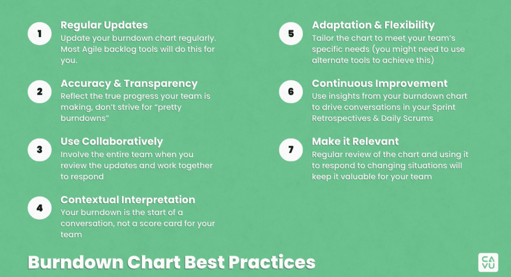
Effectively utilizing Burndown Charts goes beyond simply plotting and tracking work against time. Adhering to best practices can significantly enhance the value and effectiveness of these charts. Here are some good practices to consider:
Regular Updates
- Timely Updates: Update the Burndown Chart regularly, ideally at the end of each day (or each Sprint for larger initiatives), to ensure it reflects a consistent view of the state of work progress.
- Responsibility: Assign a member of the team to update the chart to maintain consistency. On many Scrum Teams, the Scrum Master takes this responsibility.
Accuracy & Transparency
- Reflect True Progress: Ensure the chart accurately depicts the actual progress of the work. Avoid adjusting the chart to paint a rosier picture than reality. (Managers, a special note to you: If you manage your teams’ performance using a Burndown Chart, expect your team to start gaming the tools to create an ideal chart. The Burndown Chart is a tool for your team to use as they are working through a Sprint or Release).
- Transparent Communication: Use the chart as a tool for open discussions about project progress, challenges, and solutions with the team and stakeholders.
Use Collaboratively
- Team Involvement: Involve the entire team in reviewing and discussing the Burndown Chart. Encourage team members to share insights and suggestions based on the chart’s trends.
- Stakeholder Engagement: Regularly share the Burndown Chart with stakeholders to keep them informed and engaged on work progress.
Contextual Interpretation
- Beyond the Numbers: While the chart provides quantitative data, always consider qualitative aspects such as team morale, external dependencies, and changing priorities.
- Not a Standalone Tool: Use the Burndown Chart in conjunction with other Agile tools and metrics for a more comprehensive understanding.
Adaptation & Flexibility
- Customization: As with any Agile tool, tailor the chart to meet the specific needs of your team. This might include altering the level of detail, the scale used, or the format of the chart. Keep in mind, your specific Backlog management tool might not support extensive customization of this chart. If so, consider using Microsoft Excel or something similar to generate a chart that is actually useful for your team. Checkout our microlearning on the Agile Toolkit to see one of these solutions in action.
- Flexibility in Response: Be prepared to adapt your project plan based on insights gained from the Burndown Chart. Agility is key in responding to the evolving nature of your work.
Continuous Improvement
- Retrospectives: Use insights from the Burndown Chart during Sprint Retrospectives to identify areas for process improvement.
- Iterative Learning: Apply lessons learned from both current and past work to refine estimation and planning processes in future work.
Maintaining the Chart’s Relevance
- Regular Reviews: Regularly review the relevance and effectiveness of the Burndown Chart within your Agile framework and make adjustments as necessary.
By adhering to these best practices, teams can maximize the utility of Burndown Charts as a strategic tool for their work, enhancing visibility, promoting transparency, and driving continuous improvement.


